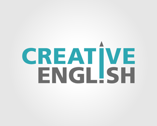
Description:
This is a logo I'm creating for a friend's English Tutoring company. I would really like your feedback on problems with the logo and ways it could be improved. Thank you.
Status:
Student work
Viewed:
5271
Share:
Lets Discuss
Hi Climax Design, what letters stand out to you as needing better kerning? I had to align the %22i%22 in the two words and also the R and E, so I'm a bit restricted with what I can move.
ReplyNo need to align on the right and left. Just line up to the pencil and space the letters evenly. CRE, EN, and GL look tight. TI looks really loose. Hope that helps.
ReplyPlease login/signup to make a comment, registration is easy