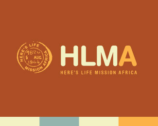
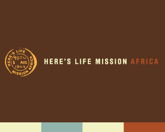
Here's Life Mission Africa
by churchmedia • Uploaded: Jul. 17 '07

Float
(Floaters:
3 )
Description:
This logo was design for Here's Life Mission Africa.
The colors used on this logo were chosen to be very warm, yet resmbling safari and africa.
The stamp was used as an icon because missionaries are known for traveling such as mail travel around the world. Also, the shape of Africa has been overused.
As seen on:
CHURCHMEDIA™
Status:
Nothing set
Viewed:
5420
Share:
Lets Discuss
The stamp is not unque to Africa it can come from anywhere in the world. Your colours are also not totally safari. I think you could come up with something better that would capture both africa and missionary work within africa which your logo design is lacking.
ReplySo much for constructive criticism . . . **I think this rocks. My favorite of the three for sure. The stamp could turn into a blob if it is scaled down too much, but I'm sure you're well aware of that.**Very nice.
ReplyThis is bay far a killer concept. The rest of the branding materials sell the idea of this logo. I must admit I am jealous a tad after being shown the final product.**Very nice Ish!!!
Replyi thought you may be interested that this company heliosdesign is using your 2 of your logo's and they have not given any credit to the relvant designers and because of this section within thier websire they are getting logo design work from it. check it out*http://www.heliosdesign.co.za/site/blog/branding/african_logo_design.html**they are using 4 of my logo's and alreday i have had comments that people tought it was their work. Let the other designers know if you know who they are as well.**Brandon
ReplyPlease login/signup to make a comment, registration is easy