Description:
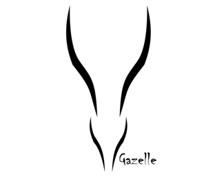
A simple logo. The task was to simplify an african animal and make a logo. This is my product, the gazelle.
Status:
Student work
Viewed:
1945
Share:


Lets Discuss
The curves are quite nice, although not perfectly smooth..**Is that font Chiller? Because it looks remarkably similar, and Chiller looks terribly amateur..So if I were you, I'd change the font, or if it's different, make the font larger...
ReplyI see your point. I have done it with smooth curves, but then i looks more like a wineglass than a gazelle. **You are right about the font. I will look into that and see if i can find another one, I will also make it a bit bigger :) **Thanks for a great critique!
Replythe lines looks nice, but thinking maybe it's a bit too minimal? cause without the text, I'm seeing something entirely different. (or maybe I just need to rest my eyes a bit...)
ReplyI think this is a great start. %5E%5E agree with the type and the addition of maybe simple eyes or maybe hint of ears to match. Just a thought. Nice form.
ReplyDefinitely loving the shape. I agree with Mikeymike, perhaps some eyes that sort of brand out a lil. Look at Springbok (Antelope) images. might help. Font has to change.
ReplyEyes that branch out! Sort of like leaves off a tree.
ReplyPlease login/signup to make a comment, registration is easy