Description:
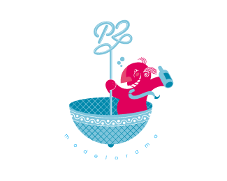
This a funny logo for a wine-shop and liquor store, the client was obsessed with the idea of a drunk on a chandelier, so here is!
P2 it's called to someone who is drunk but in a dirty language.
Status:
Nothing set
Viewed:
3598
Share:
Lets Discuss
it reminds me of french cartoon's style... I think this is too elegant for the concept but it's really nice...
ReplyLike mai said, this is a wonderful illustration, but I'm not sure how well it fits with the type treatment (I can't see it fitting with any type treatment its such a good piece of art). This would probably be more suited to a children's book, than as a concept, but gee its pretty.
ReplyPlease login/signup to make a comment, registration is easy