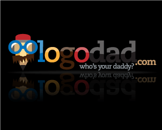
Description:
Hi guys this is my first post.
We are a design outfit that focuses on logos and corporate identity.
We can design a decent logo for our client(s). however, designing a logo for my company is a very very challenging task.
If you can relate to me, please help me move to the right direction.
As seen on:
LogoDad.com
Status:
Nothing set
Viewed:
1616
Share:
Lets Discuss
Way too much information on the pencil...
ReplyYou are 'a design outfit that focuses on logos and corporate identity'?.... hmm...**I agree with Stele and Clashmore... too much!
Replythe name is cool.. the logo not so. I agree with the 'simplify' comment. Hows about you just have the type (in one color - black!) %26 have a mustache under the g... then the o's either side could look like eyes!.. please dont go putting eyeballs in the o's though with a web 2.0 effect... keep it simple!
ReplyI'm biting my tongue.
ReplySo many elements, a macho, borat alike, geek pencil there, one color here and another overthere, 2.0 web effects, the tag line attached to the name like a remora....please simplify!
ReplyPlease login/signup to make a comment, registration is easy