Description:
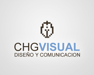
Main mark of the group CHG. Focused in desing and visual communication
As seen on:
CHGVISUAL
Status:
Nothing set
Viewed:
1405
Share:




Lets Discuss
Climax.*yes that was the intention, *is simple to see that because the thickness of the icon correspond exactly to the thickness of the typography.*The sense to do is means a minimial sign construct by %22pixels%22 or little cubes.*Whit the plus of allowing its use in supports very restricted like and favicon, websites icons for example...*Also is important see the rectangles or cubes that compound the %22figure%22 significant a digital utilization of pen..**(sorry for my english :)
ReplyI think you might want to bring the mark down closer to the text. Too much distance between the two elements in my opinion. The mark is interesting, what is it a symbol of?
Replyyes Blind, the distance in this graphic is no the usual, because when place the logo here don't correct them...*You can see how is used in usual form in the website www.chgvisual.com.*Maybe later correct this example en logopond :) with the real formal relationship..**The symbol correspond to a %22digital%22 pen.
ReplyI thought it was a knights helm at first. I see the digital pen now, but only because I am very familiar with the software, is the target market also familiar with it?
Replysome people see a female torso :)*the target of this mark also read CHG (change) VISUAL and this work in context with the %22pen%22. The idea behind the pen is do somenthing cuasi-abstract with a few elements (the same that can be seen in others marks of the group like CHGHOST, CHGBLOG, etc...)*Anyway is valid your opinion... is good play with the meaning of the symbol...
ReplyIt's a pixelated female torso...... a very chubby female :P
Replysome people see :)
ReplyPlease login/signup to make a comment, registration is easy