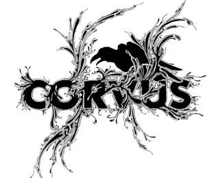
Description:
Bar, dancing, drinks
As seen on:
CORVUS
Status:
Nothing set
Viewed:
2054
Share:

Lets Discuss
This is intense! I think theres alot more going on then just dancing and drinking %3B )
Replywas part of the brief!, a sofisticate place to go :)
ReplyYou should have put a light line outlining the entire raven that is the same as the text. That would have made the raven look like it is more a part of the mark than something stuffed into the background. There is something not quite right about the raven silhouette as well, but I can't put my finger on it. I just don't think it flows in with the font and liquid treatment as well as it should.
ReplyI think this is just too similar to Si Scott style. This is probably too detailed to be a good logo at small sizes. I am interested to see if this was developed further.
Replyare you Si Scott?*
ReplyPlease login/signup to make a comment, registration is easy