Float
(Floaters:
1 )
Description:
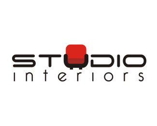
This logo is for an interior designing company
Status:
Client work
Viewed:
1079
Share:


Lets Discuss
PLease leave your valuable comments
ReplyTo be honest, the treatment of the U looks a bit forced. I believe you can come to a solution, where it has the same width as the other letters and in my opinion you%B4ll most likely sooner or later drop the leg-part.
Replyok. %5EI agree with barryconvex, use the same weight u as the rest of the letters. drop the feet... it's a modern chair so it can sit on the floor and still come off as sleek minimalist chair. I'd play with the red shape and keep it as simple as possible to make it the back cushion of the u chair - maybe float it so there is some nice white space separating the cushion from the u chair giving it more depth and readability. This is really close. *In this case the simplicity will make the logo modern and fresh. Also interiors doesn't necessarily have to stretch to the width of studio. I do like it. It has a lot of potential.
ReplyMark gets totally lost compared to the type. It looks like a heavy, black type with a splash of color%3B one has to focus to see the chair. The idea is nice though.
ReplyThank you all so much for the feedback....i think all of u make sense. I will upload the changed version of the logo soon :)
ReplyPlease login/signup to make a comment, registration is easy