Float
(Floaters:
0 )
Description:
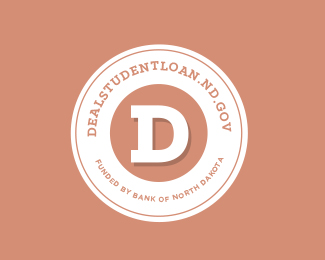
Added some depth to D... Has a college feel, since the loan is for college.
Status:
Work in progress
Viewed:
529
Share:


Lets Discuss
Anyone have any advice or comments please let me know. This project has been a tough one. Trying to figure out a way to brand student loans.
ReplyThanks in advance.
Is there a reason you didn't carry the bevel through to the right side of the D? There should probably also be shadow on the top and bottom left side of the D as well.
ReplyPlease login/signup to make a comment, registration is easy