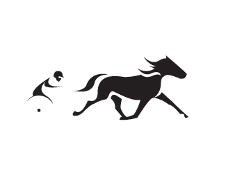
Float
(Floaters:
7 )
Description:
Event held at night for Harness Racing.
Status:
Client work
Viewed:
3272
Share:
Lets Discuss
hi, the rider is quite difficult to make out, the horse mark is good though...i see how you're trying to use negative space but i'm not sure it's working here..... thats one bloody big horse! :)
ReplyThanks James, I see your point. The horse might need slimming also.
ReplyLogo updated
ReplyI love this one. I Think its the best!
Replythanks aminlaliman I appreciate the feedback
ReplyI see you got such a great showcase buddy...your logos are interesting
ReplyPlease login/signup to make a comment, registration is easy