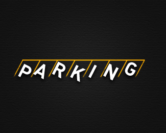
Description:
Thanks to walmart parking for this idea ;).
As seen on:
the-rcd.com
Status:
Just for fun
Viewed:
3798
Share:





Lets Discuss
accept criticism and ideas of this icon.
Replyi think you're forcing a neat idea here. I think you could easily have the type sitting normal, and just have yellow lines in between the letters and connected above the them. No need for any of the letters to be pulling in or out of a spot, imo.
ReplyThank you for your feedback, i did some changes.
ReplyCool idea! Nice work
ReplyReally think it could be a lot simpler. And I'd definitely try something other than arial. If I'm being honest, I'd just delete arial off of your machine right now %3B)
ReplyHeadlights (or are those parking barriers?) and shadows are too much. Nighttime driving has nothing to do specifically with parking, so there's really no need to have it there. I think Nathan's first comment is spot on. I'd have all the type (and the parking spaces) horizontal, not 45 degree, and then have a horizontal line above the word that connects all the parking stalls. Simple.
ReplyThanks again, modified!.
ReplySince this is a typographic piece, it's normally good to stick to general typographic rules. that being said, I'd keep all of the letters on the same baseline. I know you're going for them acting as vehicles and so parked irregularly, but I think the clever thing about this piece is the IDEA of a parking lot, not a physical representation of one. I'd clean up those yellow lines, and extend the bottom of them to make the compartments a little longer. I don't think you need the empty compartments above the letters, and I think that top horizontal line can be the same thickness as the rest. Lastly, I'd go for a slightly more condensed typeface (Helvetica Neue Condensed, or even Highway Gothic condensed seems appropriate, which is close to what you have here), and center each letter perfectly in the compartments.**Check this out:**http://www.dafont.com/highway-gothic.font?text%3DPARKING**Here they show you all the letters in little compartments! Something similar to this, with the letters a lil bigger, I'd suggest.**Hope this doesn't sound harsh, I've been accused of that before, and I apologize if that's so. However I wouldn't comment if I didn't find it interesting, and I think this could be a really neat piece for a portfolio once fleshed out!**Best,**N
Replyhahaha i understand, but this is for fun and i'm open to comments, let's wait for more comments about this piece to get a final piece.
Replyok ok, i think this change can help.
Replyty swimmers.
ReplyIt's getting better. Now I think you should your type should be bolder than the parking lines.
ReplyThis is light, to fix this i can use regular, bold or black.
ReplyI'd cant the G. there is always that dude who parks way on the end and takes up two spots at an angle to show off and keep their car from getting dinged.
ReplyFile modified.
ReplyFor me the original I saw with angled parking (but without headlights) was the most compelling. Don't know why, it just worked for me.
Replyupdate, yes, i like this version.
ReplyPlease login/signup to make a comment, registration is easy