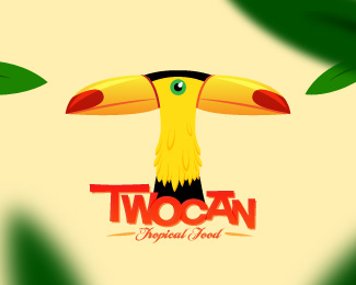
Description:
Restaurant logotype
As seen on:
the-rcd.com
Status:
Unused proposal
Viewed:
9183
Share:

Lets Discuss
crazy one --- greatillu
ReplyAwesome! I hope the restaurant is this crazy!
ReplyFor Climax, yes it's %3B)
ReplyWonderful illustration. Nice use of Shag for the type.
ReplySorry, this is just really freaky, especially for a food company. I grew up near a chemical plant and have seen ducks with two heads. Sorry and all, but this is just too far of a reach right now. There has to be a much simpler way of doing this to where you can tell it's two tucans instead of a freaky, two-headed, decapitated bird.
ReplyGood presentation of logo %3B%5D*
ReplyThank you, Nathan, a siren with double fin lives in Starbucks. That is really freaky too %3B)
ReplyTotally agree with Nathan here, both the logo and its presentation.
Reply%5E%5EI have to agree, I have a hard time looking at it for some reason. My other thought was the macron over the 'A' makes me want to pronounce this %22Too-kane%22. Nathan, I'm really sorry you had to grow up in that environment.
Replysorry, does not work for me at all...:( %0D*looks to patchy...IMO
Reply%5Ehaha it's all good. As a child it was entertaining. Looking back now it's pretty disturbing!
ReplyNathan, respect my work please. Get funny time with your own projects. i accept only constructive messages.
ReplyMmmm
ReplySorry, friend, you are absolutely right and I should have known better. I did take a look at your other works earlier and you do have some interesting work. With this one, is there a specific meaning with the 'two' can in relation to the client? Do they just like the word play of two toucans, or are they a canned food provider and they sell their product in twos? This may provide a little more insight into the concept behind the logo. I think you have the illustration style down for a tropical feeling theme, and would love to see some other concepts
ReplyDont worry Nath, this client loves toucans and he wants two in your logo. He was looking a tropical feeling in your logo.
ReplyIt's too disturbing for me to look at as well. That one eye... It is a very nice style, however. As for a two tailed siren... a logo derived from an ancient woodcut of a mythical creature doesn't compare to a modern tortured toucan.
Replytortured?
ReplyIn my opinion get rid of the bird and the leaves and you have yourself a logo that works.
Reply%5E I agree it would look better doing that, but there would be no concept. If you could perhaps work in a toucan beak or two into the typography, then I'd be all over it. I think there's an opportunity to do this right in the middle of the word, too. The 'o' and the 'c' mirror each other and could act as the basic head shape of the birds. Stick a couple beaks and maybe two subtle necks and the heads slightly point away from each other.
Replyok thanks to all.
Reply%22different strokes for different folks,%22 haha nice.
Replyhahaha ty CD
ReplyInteresting and unusual concept!
ReplyAmazing sign you've created.
ReplyPlease login/signup to make a comment, registration is easy