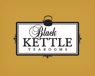
BKT 03
by c4creative • Uploaded: Nov. 05 '09

Float
(Floaters:
15 )
Description:
Version 03. Concept for a tearoom. The tearoom features a collection of kettles in all shapes and sizes in the venue.
Status:
Client work
Viewed:
2132
Share:
Lets Discuss
This would be my choice but I'm not the client :)
Replymy choice too
ReplyVery nice to see so many options. Although that'll probably mean you%B4re struggling with a %22I know it when I see it client%22. This one in b/w (minus the oval shape) would be my favourite. Nice retro feel.
Reply%5E I agree with guys here...
ReplyAgreed. The oval is uneccessary.
ReplyThis one gets my vote too.
ReplyThis looks just like a James Strange design. Does nobody else think so?
Reply%5E I think so, too. And that can only be taken as high praise.
ReplyThis one is your strongest imo.
ReplyHa! I was convinced this was Strange when I saw the thumbnail.
ReplyThanks for all the comments guys. *The colour shape behind the logo is probably not necessary I agree - we did actually present that to the client also, but the client wanted to see some colour in the logo, which is contradicting the 'Black Kettle' a little. *My thoughts is that the colour oval will change colour for various parts of the business, i.e. they are going to sell their own tea, they will have a take away service and of course the overall branding.
ReplyGood one...Lovely treatment... Best of the options...!!
ReplyThanks libran005!
ReplyPlease login/signup to make a comment, registration is easy