Taylors
by c4creative • Uploaded: Jul. 31 '08

Float
(Floaters:
2 )
Description:
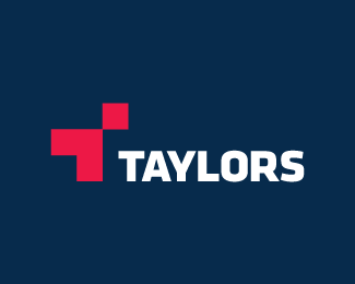
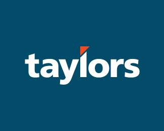
Concept 01. Rebranding of Taylors Development Strategists. Logo is still under consideration. Down to these 2 concepts.
Status:
Nothing set
Viewed:
1402
Share:

Lets Discuss
Hey 90 I see what your doing, at least I think I do? I see you don't want to make the cut above L the same or it will look like an i right? what about using the r like this %7C%5E if that makes sense.?
ReplyIt makes sense (it was in my initial concepts). The reason I used the L instead of the R is that I wanted the accent mark %26 colour to really stand out (which I felt it did more with the L).**The shape/cut in the L is taken from their current logo (www.taylorsds.com.au), which has some pretty loose meanings - flagship, a cut above the rest. It made more sense to me to use the L as it resembles a building more than any other of the letters. Does this make sense?**Thanks for the feedback logomotive.
ReplyPlease login/signup to make a comment, registration is easy