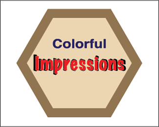
Colorful Impressions
by bryanlauer11 • Uploaded: Jul. 10 '12

Float
(Floaters:
0 )
Description:
Logo for a local ceramics shop.
Status:
Student work
Viewed:
1026
Tags:
Student Work
Share:


Lets Discuss
I do like how simple it is but I'm not to sure of what or where this logo is for. With the swirl's it makes me thinks it's for a frilly place maybe for hair or a craft store. I do Like it, i wish the background had a stroke on it to make it maybe pop more, and the swirls cleaned up a little.
ReplyIt seems classical for a logo about ceramics. I like the color choice because, like I said, it feels classic. I'm not entirely wild about how it's only an oval and two letters. (the letters are the initials?) either way, i think you could change the oval into a pot or a ceramic outline, a jar or something. or you could place a ceramic pot or something to the left of the I and under the C, so that way if someone was to see this logo without the description they would immediately know it's a ceramics shop.
ReplyI think that you were headed in the right direction but when I look at it I haven't a clue as to what it is. To me it looks like a bird with the swirls. I think that you need to refine the swirls. Also the logo needs to show what it represents.
Replybryanlauer11,
ReplyFirst thing that I notice is that your lines are NOT clean. You need to clean up the lines on your swirls. The second thing is your font doesn't fit the look and feel of the logo. If you are going for a "floral" or "art nouveau" inspired look you need to go all the way (keeping your lines clean). The two other points: first, I don't know by looking at this logo that it is for a ceramics shop (rule #4 The logo must be recognizable. #14 Avoid recent logo design trends. Instead, make the logo look timeless. #22 The logo must have some connection to what it is representing. #40 Do not use any ȁCswooshȁD or ȁCglobeȁDsymbols). I think the color is solid, the color does have some ties to ceramics but I feel a more "earthy" or "earth tones" would be more appropriate.
Please login/signup to make a comment, registration is easy