Description:
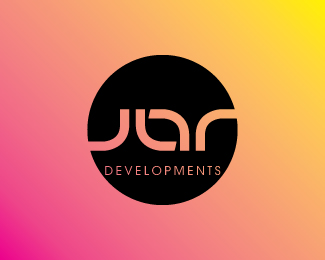
JAR is a property development company set up by three individuals whos names begin with 'J','A'' and 'R' respectively. The logo was created using the same shape 4 times, created in such a way that it is also an ambigram. Meaning it is read the same when looked at upside down
As seen on:
www.brandymedia.co.uk
Status:
Client work
Viewed:
2656
Share:
Lets Discuss
Great concept. Could use some fine tuning though, imo
Reply@ Genkai.Nashi. Thanks for you comment. The reason the 'a' does not align parallel is because all 4 shapes making up 'JAR' are the same. This can only be seen on the version I created without the circle, I will add this example to my profile for you to see. Where the 'J' and 'R' intersect the circle, creates this slightly curved line. I tried several different weights of the line, but settled for the one you can see above. Thanks for looking :-)
ReplyPlease login/signup to make a comment, registration is easy