Description:
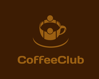
The logo resembles two people meeting/hugging/connecting in the shape of a Coffee cup / Tea Cup. It is simple, elegant and and easily recognizable even in smaller size. It is best for Coffee or Tea shops, Restaurants, Hotels, Motels, Eateries or any other beverage shops. The name "Coffee Club" is just a dummy text and can be changed. It will look great embroidered onto a T shirt, printed on business cards, letterheads or invoices, painted on the side of a van, on a web site, on hoardings or on Neon boards.
As seen on:
www.brandmango.com
Status:
Unused proposal
Viewed:
4137
Share:

Lets Discuss
Simple but elegant...The concept behind this logo is really great..It is very well executed...!!!!
ReplyThis as been one one of the finest concept and design. Its innovative with amazing design.Grt work designers
Reply%22Coffee is not just a drink, it is a social event%22 - Good use theme, colors and curves. Excellent job.
Replyexcellent idea... for connecting networks its the best logo...*gr8 work brandmango!!!
ReplyLove the simplicity and idea of people connecting along. Cool :)
Reply@vintage_chic. Haha... You said it... I took an hour to decide whether to put it or not. Finally I put it, coz Cup and Saucer are like a what... non separable twins... :) Anyway thanx for the comment!
ReplyPlease login/signup to make a comment, registration is easy