Simplifying the monk illustration even further would be good. At the moment, it looks too cliparty. The studio overlapping the 'y' looks abit odd too. I think you can find a more suitable font other than Eras.*Sorry to ramble, but I find this has great potential. Cheers!

Lets Discuss
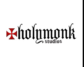
Simplifying the monk illustration even further would be good. At the moment, it looks too cliparty. The studio overlapping the 'y' looks abit odd too. I think you can find a more suitable font other than Eras.*Sorry to ramble, but I find this has great potential. Cheers!
ReplyI concur with chanpion. The monk looks slapped on there. Try to explore working him in with the type.
Replythx guys..i%3Bll keep up..
ReplyPlease login/signup to make a comment, registration is easy