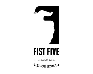
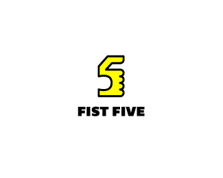
Fist Five
by bilalm • Uploaded: May. 03 '12

Float
(Floaters:
2 )
Description:
1st version
Status:
Work in progress
Viewed:
2281
Tags:
studio
•
design
•
five
•
fist
Share:

Lets Discuss
I like the type, but the mark seems a little too ambiguous at the moment. It's natural to want to do something literal with the name Fist Five, but perhaps you can work on a couple other marks to go along with the type. The backwards F isn't reading correctly. Also, the logo as a whole is very tall. Perhaps you can work on that as well. Hope this helps and doesn't discourage you. Good luck.
ReplyI gotta agree with Doc Oc here. Would love to see some more options.
ReplyThanks for the comments, really appreciated it. Well ambiguity is not an issue for me as i'm very much inspired from the hidden meaning in logos. On the other hand i totally agree with you on the height and the shape overall, its just not feel completely right, seems something is missing.
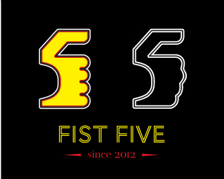
ReplyPlease check the new attepmt, this time i tried to focus on "fist" & "five" only. Waiting for your precious feedback here:
http://logopond.com/gallery/detail/169960
wow nice:P
ReplyBas thik hi hay:P
ReplyPlease login/signup to make a comment, registration is easy