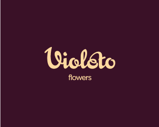
by bigoodis • Uploaded: Jan. 25 '10 - Gallerized: Jan. '10
Add to Pad (In 40 Pad s )
Description: establish Status: Just for fun Viewed: 9887 Share:
wow, it has amazing flow of lines ... what business it was done for?
Thanks, Jan.*Logo was meant for the organization involved in business registration, on the one hand visible classics, but with a different dynamic logo.
Beautiful lettering, love the flow! :)
Thanks Michael :)
I already floated this but forgot to comment. Has a really great feel to it, love the style!
Thanks Joe!
simply elegant
%5E yeahp!
agree with the rest..lovely flow, good job!
thanks guys!
Amazing and elegant with soft lines! Beautiful!
Thanks Sergey :)
Such a good balance and those soft lines... Yummy.
Thanks mabu :)
love the type!
Thanks Cris!
wow! this is so beautiful!
Thanks Sneh!
cool
Thnx Logocrave :)
looks awesome! great movement
Thanks a lot matt:)
Superb stuff Ivan, love the flow!
beautiful
Thank you guys :)
Please login/signup to make a comment, registration is easy
Follow


Lets Discuss
wow, it has amazing flow of lines ... what business it was done for?
ReplyThanks, Jan.*Logo was meant for the organization involved in business registration, on the one hand visible classics, but with a different dynamic logo.
ReplyBeautiful lettering, love the flow! :)
ReplyThanks Michael :)
ReplyI already floated this but forgot to comment. Has a really great feel to it, love the style!
ReplyThanks Joe!
Replysimply elegant
Reply%5E yeahp!
Replyagree with the rest..lovely flow, good job!
Replythanks guys!
ReplyAmazing and elegant with soft lines! Beautiful!
ReplyThanks Sergey :)
ReplySuch a good balance and those soft lines... Yummy.
ReplyThanks mabu :)
Replylove the type!
ReplyThanks Cris!
Replywow! this is so beautiful!
ReplyThanks Sneh!
Replycool
ReplyThnx Logocrave :)
Replylooks awesome! great movement
ReplyThanks a lot matt:)
ReplySuperb stuff Ivan, love the flow!
Replybeautiful
ReplyThank you guys :)
ReplyPlease login/signup to make a comment, registration is easy