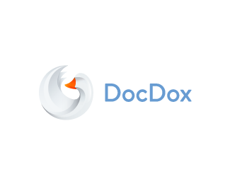


Description:
Logo redesign for service - https://docdox.net (old one is now on the site). My ready Goose logo is very approached for them. So now this company has a new logo. Do not forget to check out the monochrome version and large logo mark. Also see logo mark in extra large size here: http://dribbble.com/bigoodis/tags/goose
Status:
Client work
Viewed:
15307
Tags:
redesign
•
bird
•
internet
•
cloud
Share:



Lets Discuss
awesome Ivan!
ReplyThank you buddy! :)
Replywow great Goose!
ReplyGreat work.
Replysweet one, Ivan.
ReplyThank for feedback guys!
Replyamazing work !
ReplyMaster of gradient!
ReplyThanks for kind words guys. Appreciate it a lot :)
ReplyThanks for your comment David! I am now (in free time only) just doing my version of Firefox logo. I do not know what will come of it, but it's interesting.
ReplyBy the way, the Firefox logo are constantly inspires me to different things. I really love this logo :)
And thanks for gallery spot, much appreciate it :)
I really like the clean look. great work.
ReplyThank you bud! :)
ReplyWhat Kamil said way up there 'Master of Gradient'.
ReplyEnjoying the style.
ReplyI'd agree with climax designs. When I saw it I immediately thought Firefox, but even so, it is a very sharp mark.
ReplyThank you guys!:)
ReplyPlease login/signup to make a comment, registration is easy