iBallet
by bigoodis • Uploaded: Jun. 18 '13 - Gallerized: Jun. '13

Float
(Floaters:
99 )
Description:
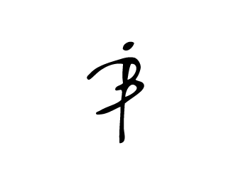
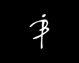
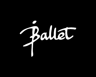
iBallet logo (check out tags please)
Status:
Work in progress
Viewed:
20888
Tags:
ballet dancer
•
iB
•
monogram
•
ballet
Share:


Lets Discuss
I hate the name, but the mark is beautiful and so perfect!
ReplyLove the mark! I wish the typography was more fluent. :) Have you tried a calligraphy style?
ReplyThanks for comments guys. I tried some fonts, but now decided to use this one.
ReplyAgree with both of the above :-) but particularly the font choice. Great mark though.
ReplyI would put a slight slant on the dot of the eye in your main font to go with the mark. That's it.
ReplyGreat mark Ivan! Nice idea David.
ReplyThanks for comments guys. I think there definitely needs adjustments :)
ReplyUPD with new type. Thanks for idea, David. Welcome for feedback :)
ReplyOh i like it like this :D
ReplyMuch better Ivan!!
ReplyWow perfect and awesome update. Completely better than before!
ReplyI daje v oblasti baleta :)
ReplyThanks a lot guys. Feedback is very helpful here. Much appreciate it :)
ReplyThis is lovely!
Replynailed it!
Replykruta!
ReplyFantastisk!
ReplyCooool!!!!!
ReplyThanks for all comments!
ReplySo so good my friend! Nothing else needs to be said...
ReplyCheers Rich :)
ReplyNow that's solid. Nice tweak.
ReplyClassic! Love this one, Ivan.
ReplyThank you guys!
Replysuper mega cool :)
ReplyLove the look of this, and I love the mark on its own, but I read it as ȁCBalletȁD and not ȁCiBallet.ȁD I didn’t realize the ‘i’ was in there until I saw the name of the company at the top of this page.
Replyhow can I contact you please?
ReplyClick bigoodis?
Replylove the font
Replyexcellent font
ReplyHello, love the font. Anyone know the actual name of it?
Reply@magnoliastar custom
ReplyPlease login/signup to make a comment, registration is easy