Float
(Floaters:
3 )
Description:
Just for fun. Fiancee started work a children's hospital, so it's been on my mind.
Status:
Just for fun
Viewed:
2248
Share:


Lets Discuss
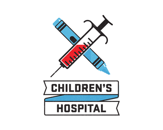
I realize it's for fun, but I'm not so sure showing a large syringe with red liquid in it (blood?) is the best symbol for a children's hospital. That combined with the fact that the syringe and crayon form an %22X%22 kind of makes this a scary-ass logo for kids. Sorry.
ReplyHey, thanks for the comments. Yes, I realize this would never (and should never) work in the real world. I just thought it was kind of funny, and I enjoyed making it. Nevermind. I'll stick to posting serious stuff...I guess that's what this site is for anyway.
ReplyAgree with the above statements. It's very well-illustrated, but definitely not right for the audience. I do realize you did this just for fun, and meant for it to be tongue-in-cheek. If you were ever to pursue this as a proposal, I'd suggest rotating the X so that it forms a medical cross, and replacing the syringe with a thermometer. That way, you can keep the tick marks, and even the red liquid, but it won't be so scary.
Reply@bhurst - I don't think the comments on this logo should deter you from posting stuff of a less serious nature. I think this site is about both good design and professional insight, so serious or not you should definitely keep posting. As for the logo, I still stand by my initial comment but I should also add that your design skills are great. Keep posting.
ReplyYeah maybe a band aid would work.. and then you could potentially rotate it 45 so it's more of a cross than an %22X%22.. then you could potentially shrink it and put it to the left of some nice, simple type.. just a thought.. it would make it more %22serious%22 then..
ReplyNO NEEDLES!!!
Reply%5EWaaaaaaahhhhhhh!
ReplyPlease login/signup to make a comment, registration is easy