KL/kovo inox
by bettacecutti • Uploaded: Jan. 28 '14

Float
(Floaters:
0 )
Description:
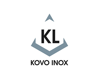
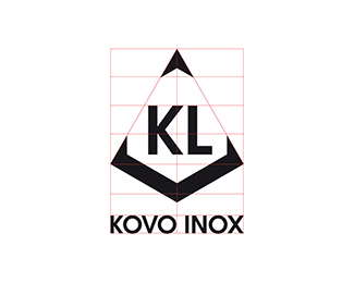
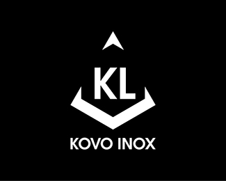
This identity has been designed for KL Kovo Inox, a Slovakian factory specialized in the production of stainless steel products. The logo had to represent the strength and resistance of this material, combined with the shape of a triangle, loved by this client as synonym of sharpness and dynamism.
As seen on:
www.kl-kovoinox.sk
Status:
Client work
Viewed:
1345
Tags:
•
brand identity
•
inox
•
iron
Share:

Lets Discuss
Please login/signup to make a comment, registration is easy