Float
(Floaters:
0 )
Description:
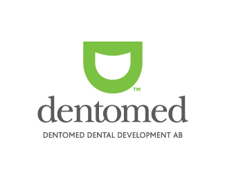
Logotype for a dental company. I would be happy to hear some feedback please!
Status:
Nothing set
Viewed:
958
Share:


Lets Discuss
I think the strongest thing going here is your type choice for dentomed. It's a clean serif that feels medicinal and safe, although you need to fix your kerning(most specifically around the e's.) The mark itself isn't very exciting to me, but it has possibilities. Maybe if I saw some collateral pieces that utilize it well I might feel differently. The type on the bottom needs to have its kerning slightly adjusted as well, and I might even space out the letters a bit more to let it breathe. Also move that bottom line a bit closer to %22dentomed.%22 Good luck.
ReplyGreat feedback, thanks!*I'm acctually thinking of using the logo as a part of illustrations, mostly as frontpage of brochures etc that the dental company produces. I've added a few examples of how it could be applied. Now i've got to take of the kerning....*Once again, awesome feedback.
ReplyPlease login/signup to make a comment, registration is easy