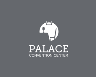
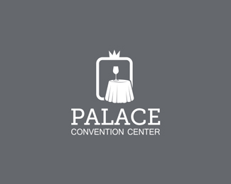
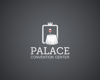
PALACE
by beczukdavid • Uploaded: May. 14 '12

Float
(Floaters:
2 )
Description:
Logo proposal for PALACE - convention center. An event
Status:
Work in progress
Viewed:
1561
Tags:
black and white
•
monochrome
•
negative space
Share:


Lets Discuss
Please guys can you tell me what you think? I need the feedback before I present this to the client.
ReplyThank you.
Its a tablecloth, and I thought in negative space it enhances the volume. I don't know maybe I'm totally off with this :)
ReplyWhat about the variant?
ReplyIt looks pretty in general, but both of the variants look like Packmans to me) May be the problem is in the cloth.. It's not recognizable at all..
ReplyI have reversed the negative space, please check out variant 2 and tell me what you think. I retained the P letter that way and I think the tablecloth is more evident now.
ReplySorry about the boring grey color but its the new webpage design color that will be used on the webpage and I can not change that background color. :)
ReplyGood idea about the whine and corners I will try it out. What do you think if I would add a color to the letter to bring it out a bit?
Reply@liandr yup I think variant 1 (the one with the circle) does look like pacman :))
Updated the variant
ReplyThank you all for your feedback it is very helpful to receive feedback from another viewer.
ReplyPlease login/signup to make a comment, registration is easy