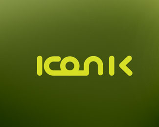
IKONIK DISTRIBUTION
by bebedotno • Uploaded: Aug. 27 '08

Float
(Floaters:
0 )
Description:
an earlier version - I guess I liked it better that the customer...
Status:
Nothing set
Viewed:
2032
Share:


Lets Discuss
I think this would look better without 'K over O' effect... I can see that it makes some kind of arrow or something, but the type makes it interesting enough (except the O all letters are squared type but this makes the O square to)... Cool...
ReplyI agree. Stronger without the K overlap.
ReplyThe problem with that would be the letterpacing - so the option would be to make them as one form... I guess**thanks for feedback - it did not end on this, but I liked this better that the final.
ReplyPlease login/signup to make a comment, registration is easy