Description:
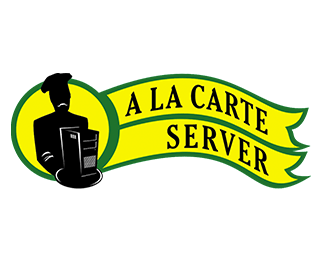
Logo developed to a host server. In the site you can choose and build your machine, like you choose a food for example.
As seen on:
http://www.alacarteserver.com
Status:
Nothing set
Viewed:
1351
Share:




Lets Discuss
Well, it's a start. Here's a few suggestions:*1.) I think the colors you chose are a little jarring and tend to vibrate against one another. I would consider a new color palette.*2.) Your type is a little old fashioned for a company that is in the computer business. Consider a more modern sans-serif font.*3.) The computer illustration is ok, but your %22chef%22 illustration needs work. First of all it looks like he's frowning - I would imagine that he should be happy since he's serving you a new computer that he built. Second, having him all black is a bit ominous/scary. Consider adding a little more detail to him, especially in his face to make him less ominous.*4.) You need to fix/refine the area where your circle meets the two ribbons as the connecting line is too thick.**Hope these comments help. Good luck.
ReplyPlease login/signup to make a comment, registration is easy