Description:
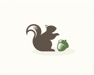
Its an advertising company. the squirrel is subtly shown as blind by its gesture (not looking at the acorn)
Status:
Work in progress
Viewed:
3856
Tags:
green
•
acorn
•
squirrell
•
blind
Share:
Lets Discuss
I like the style - very clean and simple. Not sure I would have picked up on the whole blind squirrel thing had you not mentioned it, but I don't think it hurts the logo in any way.
ReplyReally nice work.
wow)!
ReplyCool picture!
Reply@sdijock I love your comment :)thanks this is healthy :)
ReplyThanks guys!
Replyi agree with sdijock, anyway, it looks great.
ReplyHi baspixels, me and my friends are looking for a logo for our new enterprise and we like some of your designs, we would like to buy one of them, you have any email where i can speak with you?
ReplyGood work! (sorry for my english)
Please login/signup to make a comment, registration is easy