Description:
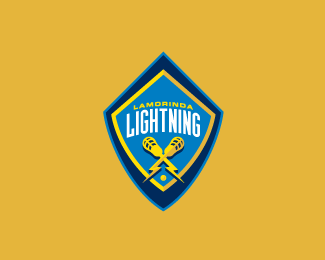
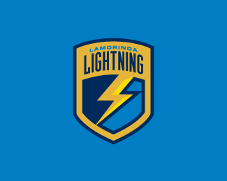
Designed for a club lacrosse team as its primary sports branding. The mark had to have a element that could stand on its own for marketing purposes as well as a secondary mark.
Status:
Nothing set
Viewed:
7872
Share:


Lets Discuss
I really dig this, but I wish it could be more focused on the lacrosse stick. I think the type will be too small when the mark is reduced to a reasonable size. I like the subtle shading on the stick too, I think you're really close to something that could be fantastic, keep working!!!
ReplyHey Bart - big improvement on the original logo IMO. However, I have a few suggestions for you. 1) Reduce the height of the top point of the shield. It's creating a huge empty space above the type which I don't think you need. 2) I would make the lacrosse sticks/bolts larger and longer - they feel a little small and stumpy right now. 30 Tighten the kerning between the %22H%22 and the %22T%22 and the %22T%22 and the %22N%22 in %22LIGHTNING%22 as it's creating a large visual gap in the word. **It's coming along great though. Nice work.
ReplyI agree with sdijock, and really do like the overall look. Great color scheme, similar in feel to the LA Galaxy (http://web.mlsnet.com/t106/) but am thrown off a bit by sky blue here: lightning makes me think of moody, steel gray, which too would go really well with the gold and navy. Overall, I simply like the look. Hell, I'd wear their t-shirts!
Replyreally nice Bart :)
ReplyLove the lacrosse stick lightning bolts, Bart, but is that the Colorado Rapids crest I see there?
ReplyI really dig this one. Good job.
ReplyCool Bart. Have you tried putting more emphasis on the club name? Perhaps have it extend outside of the shield?
Replygreat stuff. would love to see a larger version of it though %3B)
Replyway to be original and use the Colorado Rapids shield design.... **same shield: check*arched sans serif text: check*equipment for sport below script: check**see for yourself: http://www.norcalbuffs.com/wp-content/uploads/2008/08/colorado-rapids.jpg**
ReplyI would like to see the lacrosse stick lightning bolts extend over the shield.
ReplyThe Colorado Rapids Soccer logo's arched font has a serif. But it certainly looks as though this logo was overly inspired by it. I have to agree, a little too much so. Use of wide, low slung shadows is the same. It is too close for comfort.
ReplyI have to agree with others, this logo is far too close to the Rapids logo. If I were you, i would take the elements that are working, the crossed sticks, and try again.
ReplyThanks for the comments people. These words are EXACTLY what I wanted to show my client on this project.
ReplyI can't help it, it reminds me of Chiquita banana stickers :-)
ReplyPlease login/signup to make a comment, registration is easy