Description:
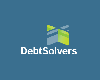
Designed for a company that specializes in helping the consumer erase bad debt and repair poor credit decisions.
Status:
Nothing set
Viewed:
5885
Share:



Lets Discuss
Clever use of the credit cards, Bart. Nice job!
ReplyI see a cross and a signpost. Nice one, Bart!
ReplyAesthetically I like it very much but the concept itself seems a little weird to me. The two intersecting cards don't represent %22solution%22 very much. To me its rather negative since its complicated, the cross shape is also not very positive (a tick would have been more logical to me)*Nice work anyway.
ReplyI tend to agree with Art Machine. When I saw the mark...I immediately thought of when someone cuts your credit card in half (not that it's ever happened to me). But then again...that's a problem that needs solved.
ReplyMan... its a good day for me right now! Thanks David.**The concept behind this was to form a X out of the credit cards. Since credit cards are the most common debt causing problem. The reasoning for the X was that payments / debt%3DX. X being the solution.
ReplyI instantly thought of a signpost and guide to debt free life. Great imagery, and metaphors.
ReplyExactly as I saw it, hellouriah, even though that wasn't barts intention%3B signposts giving people a new direction. Secondly, I saw the X but got a positive rather than a negative vibe. One of the UK's biggest Banks, the Halifax has a bold X in it's logo.
Reply@climax: probably better you don't have names attached. Good is good. Good goes in the gallery regardless of how many he/she might have.
ReplyThis is a nice logo and a good attempt at adding extra meaning while maintaining simplicity. If people read different meanings at least they are reading something... would love to see it with a slightly stronger background color also...
ReplyDUDE...you rock! awesome stuff!
ReplyPlease login/signup to make a comment, registration is easy