Float
(Floaters:
15 )
Description:
Conceptual right now. More details to follow.
Status:
Nothing set
Viewed:
4968
Share:



Lets Discuss
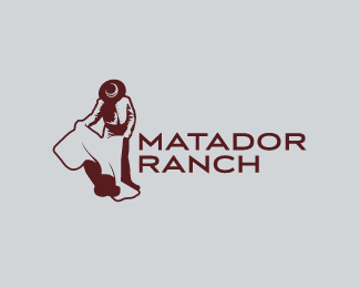
Whatever it is.. the execution is lovely!
ReplyYep, very nice.**The only thing that bothers me a little bit is that the 'carpet' has less detail than the man.
ReplyIt has detail trust me. I am waiting for presentation to the client and then I will show the detail there. :) Be Patient.
ReplyNo bull %3B)
ReplyNoble Carpetfitters?
Replylove it :)
Replyi actually like the way there is detail on the torero but the capote is clean, as it flows from the light on his hand %26 leg very nicely... even though you may have a version with detail...
ReplyI have to agree... I like the simplified cape—I think people will get it! It's very nice work, I'd almost hate to see type with it, as is inevitable.
ReplyThanks everyone. I updated the image above.
Replyfont seems kinda sharp for the image. and I liked it on the cream colored background better :(
ReplyWhat logo? All I see is an illustration...haha, just kidding. Good work, Bart. This is nice.
ReplyPlease login/signup to make a comment, registration is easy