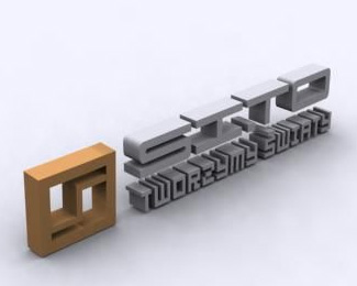
SI.TO 3D logo
by barteks • Uploaded: Sep. 07 '07
Description:
Just one of my pretty old 3D logos.
Status:
Nothing set
Viewed:
1579
Share:



Lets Discuss
its too difficult to read.. add some reflections, more... i dont know, something..
ReplyYeah, it's pretty old one. I've recently found it on my comp and put in here. I'm not going to do anything much with this as I don't even have source file anymore. It was a quick render with some basic materials on it, that's why no reflections or anything. Anyways thanks for leaving a comment %3B)
Replyits max scanline light tracer, right?
ReplyNice, but just too much angle %26 shadows.
ReplyYeah, that was scanline lightracer, nice guess. I agree, maybe too big angle and too dark in places. Hm.. I made a pretty long break from 3DS max for some time, maybe it's time for some new 3D logo.
Replyi love this logo what is your method for creating it? what was the program used if you dont mind me asking?
ReplyThanks for the comment BV. 3DS Max was used to create this logo. It's software for creating 3D graphics.
ReplyPlease login/signup to make a comment, registration is easy