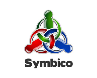
Symbico
by barrycrous • Uploaded: Oct. 18 '07

Float
(Floaters:
2 )
Description:
Just an update from the previous one.
Status:
Nothing set
Viewed:
2720
Share:


Lets Discuss
i like the look of this... the the mark maybe too big?.. how does it look without the gray shadows?
ReplyI like this too! - are they to represent 'T's?
ReplyArrows perhaps? Is the space between S %26 Y and Y %26 M a little greater than all the other letter spacing?
Replythnx for the crits guys, the image is abit flat without the shadows and it should represent arrows, the client requested a logo with %22interconnectivity%22. Unfortunatly the client had gone for the second prototype which I will upload as soon as it's finalized.**Thxn again for the comments
ReplyThis work is suitable for the World Cup!!
ReplyPlease login/signup to make a comment, registration is easy