Description:
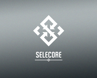
Final logo approved by client.
Located in Finland, primarily focusing on iporting new innovative products and secondary focus is in exporting items produced in Finland. Client wanted serious, modern and strong logo. He also mentioned that he loves when the logo has a hidden feature or message.
In the mark letter "S" is made of arrows pointing inside (import). In the negative space you can see arrows pointing out(export). The negative space also forms a cross which is connection to Finnish flag.
I appreciate your comments, thanks in advance!
As seen on:
Dribbble
Status:
Client work
Viewed:
9329
Share:
Lets Discuss
Strong concept. Love it!
Replynice !
ReplyPlease login/signup to make a comment, registration is easy