Description:
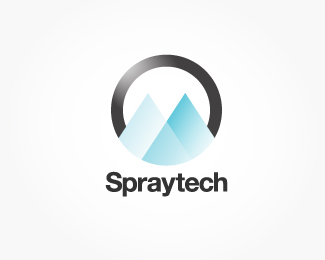
Chemical spraying application equipment specialists. Client asked for a minimal, modern feel. The logo works in black/white with the shading (pictured) and without.
Hopefully I have conveyed the spraying vibe in this - the triangles overlapping are representative of spray boom nozzles spraying out chemicals. If you google it you'll probably see what I mean, possibly this will be more apparent to the company's customer base.
Any critique welcome. I am unsure on wether to do something new with the type, they have been using the standard Helvetica Bold as shown here so far.
Thanks in advance for your constructive criticism!
Status:
Work in progress
Viewed:
350
Share:
Lets Discuss
Please login/signup to make a comment, registration is easy