Jolt Coffee Co.
by axl • Uploaded: May. 01 '09

Float
(Floaters:
1 )
Description:
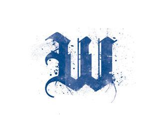
A "coffee ring letter" is not necessarily a groundbreaking concept for a coffee shop, but the execution and name are clean and new.
This is just a concept and name I created and wanted to visualize it. I can see the interior and collateral coming together nicely for a coffee shop with this logo.
How can it be improved? maybe give the stain more weight to match the letterforms? increasing the weight of "coffee co."?
Suggstions and critique sought.
Status:
Nothing set
Viewed:
3772
Share:


Lets Discuss
I like the main lettering. coffee co. extends to far to the right and I'm not liking the font style.
ReplyWhat is it the thread of his mother?*Try to be more professional before commenting on the work of others*A little bit of ethics is Bome saves teeth.
Replywhat are you talking about? when was i unprofessional and unethical?**please explain these accusations.
ReplyPlease login/signup to make a comment, registration is easy