Screening Logo
by tropicalfruitsalad • Uploaded: May. 13 '08
Description:
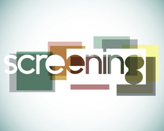
Screening is an imaginary magazine about independent film I designed for a college course. The logo is meant to resemble single pictures coming together to produce a movie.
Status:
Nothing set
Viewed:
3131
Share:



Lets Discuss
i like the treatmeant of the text. *how does it look like on its own, without the colored boxes
ReplyMight be cooler if your shapes were all the 16x9 aspect ratio. These (except for the type block) are closer to 4:3 anamorphic (tv). Also might work if the type box isolated the %22screen%22 portion. Works better as a natural word break and highlights the screen graphic.
ReplyI agree with gthobbs. I thought this was for a screen printing company before I read your description.
ReplyChange the colors to CMYK and it would PERFECT for a screen printing company. Name and all.
ReplyPlease login/signup to make a comment, registration is easy