Student Union Logo
by DesignPhase • Uploaded: Oct. 18 '07
Description:
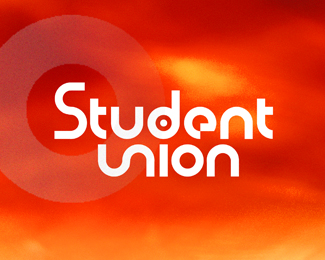
Logotype for High School student youth group. I ended up designing this font to have the “u” & the “n” create a union of elements (to conceptionally play off the word “union”)...and later tried to create a union of the two words with the dot of the “i”. I tipped the “u” & “n” up to make the cap ”S”. This will be used througout their branding including: t-shirts, signage, brochures, etc.
Status:
Nothing set
Viewed:
5285
Share:

Lets Discuss
i think your colour scheme is a bit strong specifically the orange tones can be quite distracting especially at the bottom, to me its draging my eye away from the text. hope this helps
ReplyHi sipherlucian...the color schemes actually changes per application...the constant is the white type...the students really like intense 70's-like colors. Thanks for the comment.
ReplyI can tell that the S and the UN have been chopped together, i'd spend a bit of time trying to make them smoother
ReplyHi Jodz...you caught me (that's what I love about my fellow creatives...we notice the most subtle details)...this is only a quick Quark/Photoshop comp (about two hours)...I need to fine-tune the junction point you mentioned. I'm just trying out the big-picture concept and will need to redraw it in Illustrator for the final (I love to draw in Quark...old habit). Thanks!
Replyyour welcome, well if students like it go for it, its the same in ireland, student union logos change all the time in trinity college but they always manage to keep the retro colours etc. i guess it keeps the defining line between students and corporate logos... just wondering if you could take a look at some of my logos i uploaded yesterday just after you, wouldnt mind a comment. neuralcore and safetech. they are my first, not really a designer, animator by trade.
ReplyPlease login/signup to make a comment, registration is easy