Description:
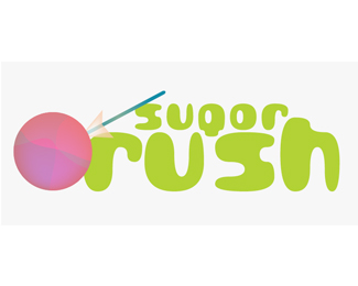
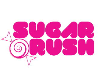
A logo I am working on for advanced typography class. It is for a candy store. A critique would be much appreciated! ^__^
Status:
Nothing set
Viewed:
688
Share:

Lets Discuss
I like it, i would just maybe try to get the lollipop look like it's a part of the logo, maybe you could replace the a of sugar by it , and i would put the lollipop in the sugar rush color and vis and versa :)
ReplyPlease login/signup to make a comment, registration is easy