Saniport
by apicula • Uploaded: Jul. 01 '13


Float
(Floaters:
0 )
Description:
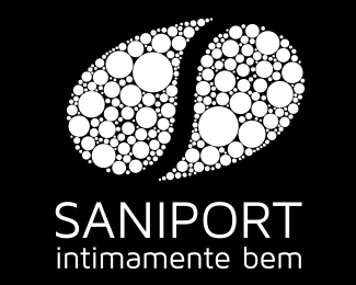
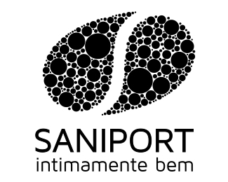
To create the Saniport’s identity, the element of inspiration was the water. The logo is thus made up of two droplets whose colors represent the duality / balance of hot and cold. When water vapor meets a cold surface (as in a toilet when bathing, for example), some small water droplets appear, represented by the logo particles.
As seen on:
Saniport's website
Status:
Client work
Viewed:
1644
Tags:
cold
•
hot
•
drop
•
water
Share:
Lets Discuss
Please login/signup to make a comment, registration is easy