Race Glaze
by apelembe • Uploaded: Mar. 08 '10

Description:
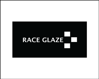
This logo is extremely clean and simple but these squares might not look like more than a race flag. The concept of this logo it’s all about cars, race and speed. The colours black and white are used as these are the colours of a race flag. The stark contrast of white on black ensures that the audiences eye is drawn to the image.
This would particularly appeal to the target audience (elite market) because the clean, clear lines hint of sophistication and class. The race flag is also linked to wealth and afflence. It is an easily recognisable symbol that has been around for a long time, and therefore the association with cars is immediate.
As seen on:
no
Status:
Student work
Viewed:
645
Share:


Lets Discuss
Please login/signup to make a comment, registration is easy