Float
(Floaters:
0 )
Description:
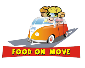
logo for a satellite kitchen concept
Status:
Nothing set
Viewed:
891
Share:


Lets Discuss
Well,The van and the food look like two completely different illustration styles - which isn't working too well. And the illustration of the driver is just plain strange looking. Finally, the phrase %22FOOD ON MOVE%22 sounds very odd. You should definitely re-work this one.
Replyditto ditto ditto
ReplyPlease login/signup to make a comment, registration is easy