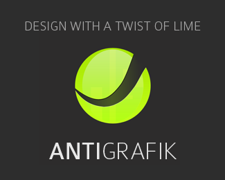
Description:
Graphic, Design, WIP, Portfolio
As seen on:
my personal portfolio site
Status:
Nothing set
Viewed:
802
Share:
Lets Discuss
Green pepsi?
ReplyIs not in any way similar, is not true without unnecessarily design information to anyone.
ReplyDidn't quite understand the last comment but the sphere is very similar to the refined pepsi logo...i can tell you that because i have a pepsi infront of me right now. The line 'design with a twist of lime' has a lot of potential, but i don't think this approach is effective.
ReplyI can show you dozens of logos that have the same appearance. :)%0D*In addition, your logo looks like that is on the carton. :(
ReplyI'm so lost. All i am saying is that the idea behind it (the tag line in particular) has a lot of potential. Lots can be done with it. I don't think a pepsi-like logo would be an effective visual solution because it's a) already in use by pepsi b) doesn't communicate effectively c) can confuse people. Check this out http://gmdist.com/yahoo_site_admin/assets/images/Pepsi_Logo.2755211.JPG
ReplyIt does look a bit like the Pepsi fat-man logo...
Reply%5ELol
ReplyPlease login/signup to make a comment, registration is easy