Float
(Floaters:
0 )
Description:
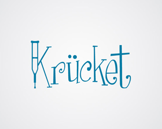
Proposal for a company that worked with making additions to crutches.
Status:
Unused proposal
Viewed:
914
Share:


Lets Discuss
i think the type choice may be too playful, and the crutch kind of looked like a giant syringe. it is an accurate depiction of a crutch, but that's what it looked like at first :P
ReplyThank you for the critique gyui, I see what you are getting at. Would you have any pointers of how to depict the crutch without making it look like a syringe?
Replyyou know, i will take that back about the crutch. it looks exactly like a crutch, and i'm guessing you'll get a majority of people seeing a crutch vs. a syringe, and so I would determine how to use the crutch with a better type choice. That i think still needs to be changed.
Replyaneki: i agree with gyui about the type (too playful) maybe a heavier weight font might help the theme of holding people up... like the concept
ReplyYeah, I guess you're both right actually, will have to do something about that type.
ReplyPlease login/signup to make a comment, registration is easy