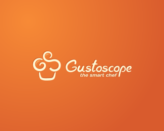
Description:
Gustoscope is a culinary recipes website. The mark is based on the 2 main letters of the name: G & S, creating the shape of a muffin. Also, you might see the chef's toque. You might even read "GUS". Custom type created to fit the mark.
As seen on:
Gustoscope
Status:
Client work
Viewed:
16406
Share:
Lets Discuss
Concept, colors, type...Everything is perfect.
Replysmart one..
Replynice:)
Replyme likey
ReplyI like mark :) well done
Replythanks a lot guys! the client seems very happy with it.
ReplyVery clever, Andreiu!
Replynice brother.. really nice
Replyweyyy, love it
ReplyVery nice!
ReplyGreat played!!
ReplyBravo man!
Replyvery nice!
Replyi love this one! very smart!
ReplyVery nice design. The way you have made the letters g and s into the muffin shape is excellent.
ReplyCheers my friends! Thanks for your comments and your constant support.
Replydelicious stuff
Replynice logo concept
ReplyI just found out this logo will be featured in the LogoNest01 book.
ReplyAlways love this one. Congrats.
ReplyPlease login/signup to make a comment, registration is easy