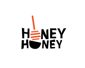
Honey Honey
by anam • Uploaded: May. 12 '10

Description:
This is a logo i am working on. i cant decided where to go from here. i need some critical feedback.
Status:
Student work
Viewed:
510
Share:
Lets Discuss
I'm liking it as is. You could maybe make the bowl a little rounder, more %22o%22 like than %22u%22 like.
ReplyPlease login/signup to make a comment, registration is easy