Float
(Floaters:
3 )
Description:
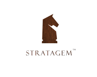
Stratagem is a futur bureau of marketing strategy in Germany
Status:
Nothing set
Viewed:
3089
Share:


Lets Discuss
http://logopond.com/gallery/detail/37845
Reply1) lose the texture on the graphic%0D*2) never use copperplate for text (assuming that's what the tagline is) - it always looks cheap.%0D*3) work on the kerning between the letters in the name (ie R-A)
ReplyThanks Cobaltcow for the typo and tagline comments , but the Idea of the Texture is Important for this concept
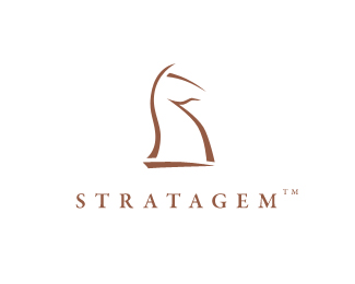
Reply@Climax: Agree! I was just making a comparison for no reason. Think that this 2 horses just look good! I would maybe put 2 of them back to back! Like they're 'covering every corner' (strategy)... Like the logo...
ReplyThanks guys!
ReplyI like the knight and the texture. Better than more whimsical version I saw earlier.
ReplyPlease login/signup to make a comment, registration is easy