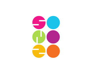
Description:
...
As seen on:
http://www.sonozo.ru/
Status:
Client work
Viewed:
12855
Share:


Lets Discuss
Love this vibe. Would need accompanying typeset but really cool brand. Looks like all 3 of the left shapes got flattened just a tad on the left curve.
Replysushi?
ReplyThanks Glen! Yes it did seem to be a little flat on the left curve,but now I have corrected it.
Replyyes!
ReplyYes indeed! Nice. Although, seems like if you reflected the 'N' horizontally it would read better. At the moment it looks like a backwards N?
ReplyI agree, the N is inverted. At first I tought it was on porpouse, to look like the S had just spin a quarter round, but then the Z is the S reflected. The N kinda breaks the hole look.*But still an awesome logo.
ReplyI think you guys were right ,it looks better with the %22N%22 flipped.Thanks
ReplyHi, I see that idea of your client work was copied - look there: http://www.sohos.lt/
ReplyReminds me this http://www.sohos.lt/ Nice logo though
Reply^^^ - they have stolen this logo, please, write them a nice letter and have a tak, ask for money, to refund your logo :)
Replywe cant tolerate things like this.
They not even change the colors!
ReplyThanks a lot for the floats and comments guys!
ReplyAs for the logo being copied ,it was brought to my notice earlier and I did email them several times but did not get any response.
http://www.facebook.com/sohos.lt
Replyhere is their facebook, try to write on the wall
Thanks Deiv.I have let the client know about it and he has shot them an email.
Replyawesome typographic job !!
Replya esto yo le llamo genialidad, perfecci�n
ReplyPlease login/signup to make a comment, registration is easy