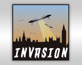
Invasion Media
by alexward1981 • Uploaded: Aug. 06 '09

Float
(Floaters:
0 )
Description:
The third Invasion Media Logo attempt.
Status:
Client work
Viewed:
1350
Share:
Lets Discuss
i like the concept, but the knight and castle seem to be in a very different style to one another, my eye seems to dart back and forth between them uncomfortably. i don't think its necessary to have both in there for the idea to work
ReplyPlease login/signup to make a comment, registration is easy